Back to projects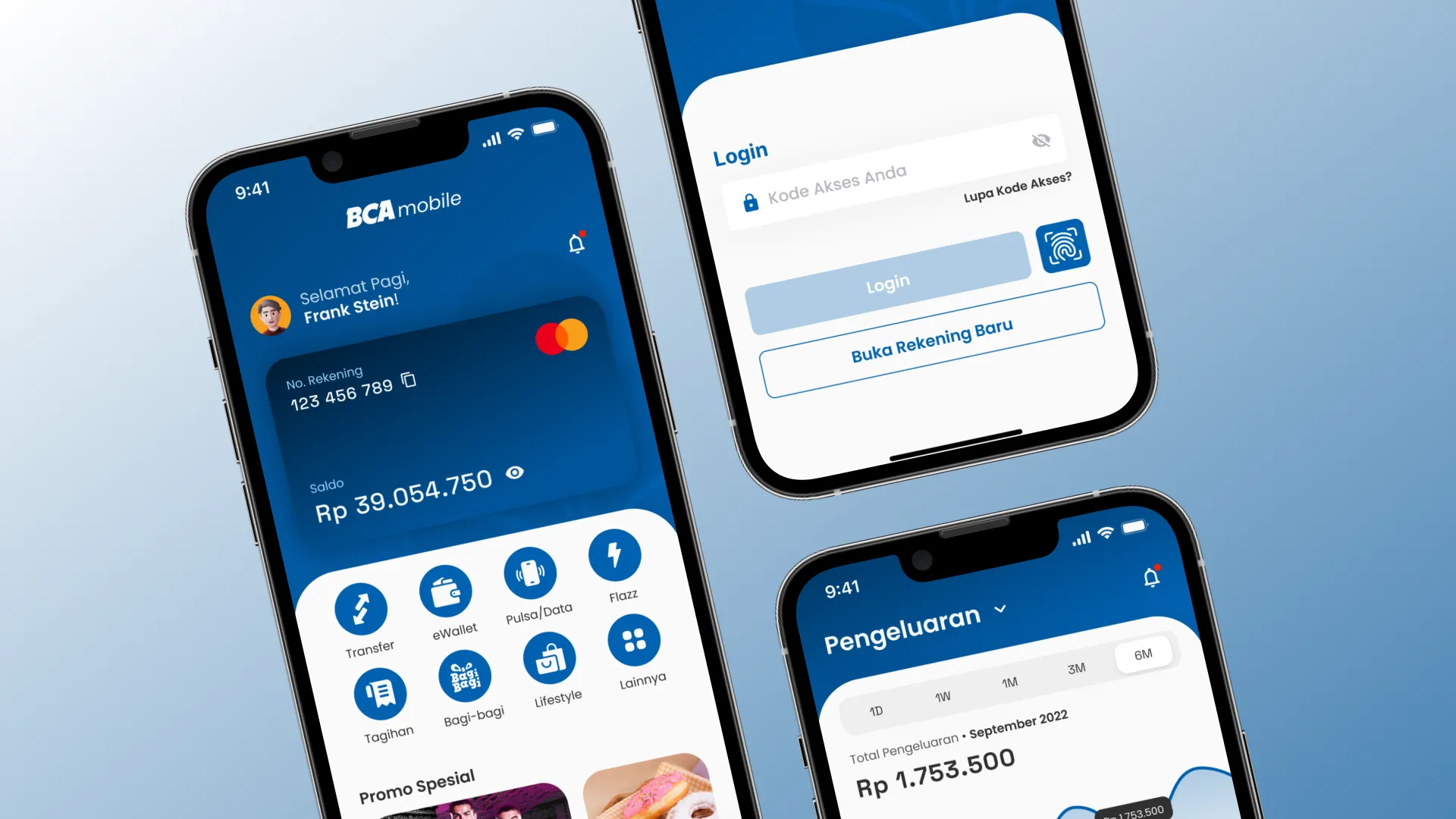



Mobile · Concept // 2023
BCA Mobile (Concept)
Rethinking a familiar experience without breaking habits.
Redesign StudyConceptFintechUX Research
ClientBCA
RoleProduct Designer & Researcher (Self-Initiated)
Timeline3 Weeks (2023)
Live LinkInternal System
01.
Overview
BCA Mobile is an app millions of people already have muscle memory for. Instead of redesigning it from a blank page, I picked apart the existing design decisions first, tried to understand why certain legacy choices still hold up, then ran a full research-to-testing process to see if a redesign could improve usability without breaking habits nobody asked to unlearn.
02.
Discover
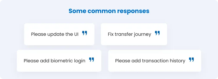
I collected feedback from active BCA Mobile users and ran a competitive scan against similar banking apps to see where the interface was creating friction. The complaints that came up repeatedly: an interface that felt dated, a transfer flow that took more steps than it needed to, and no biometric login despite it being standard in comparable apps by now.
Commons responses from user feedback on app store and play store
Competitive analysis
03.
Define
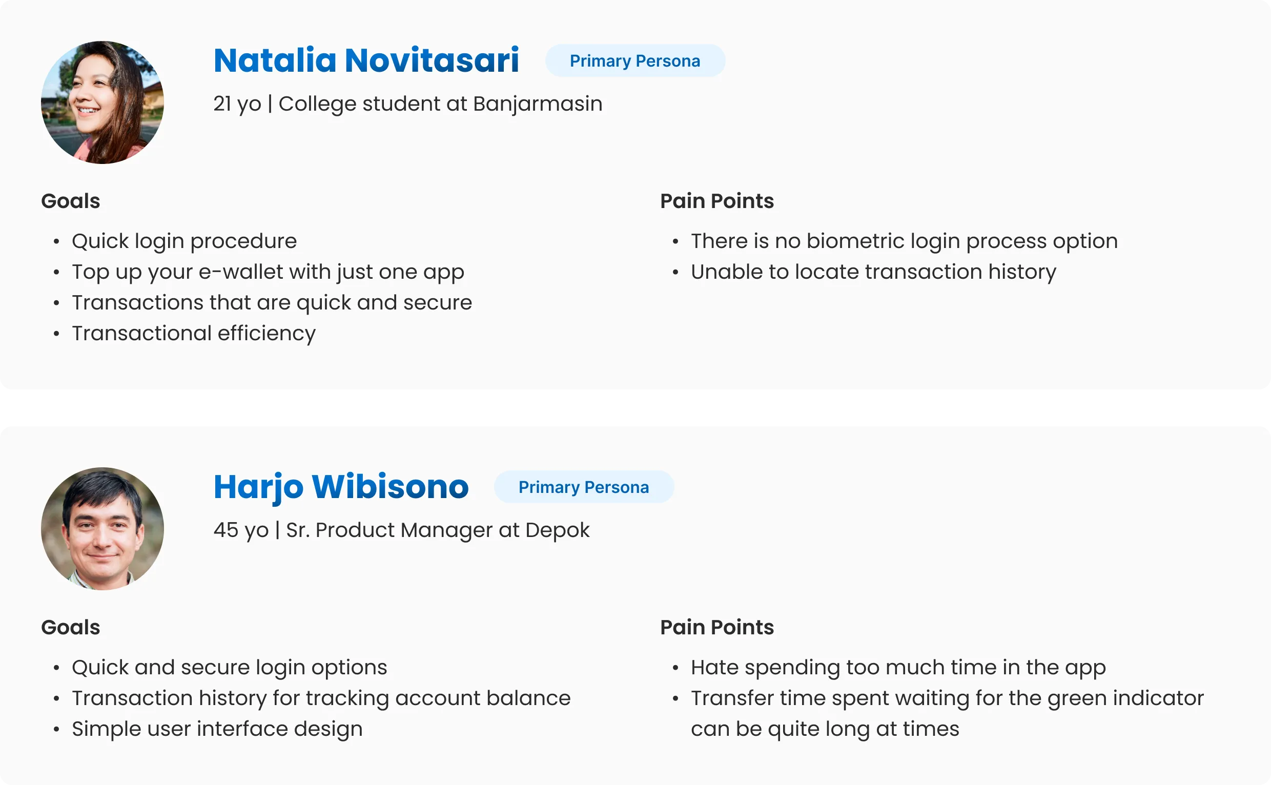
Two user personas anchored the rest of the process, built from the discovery feedback rather than assumptions.
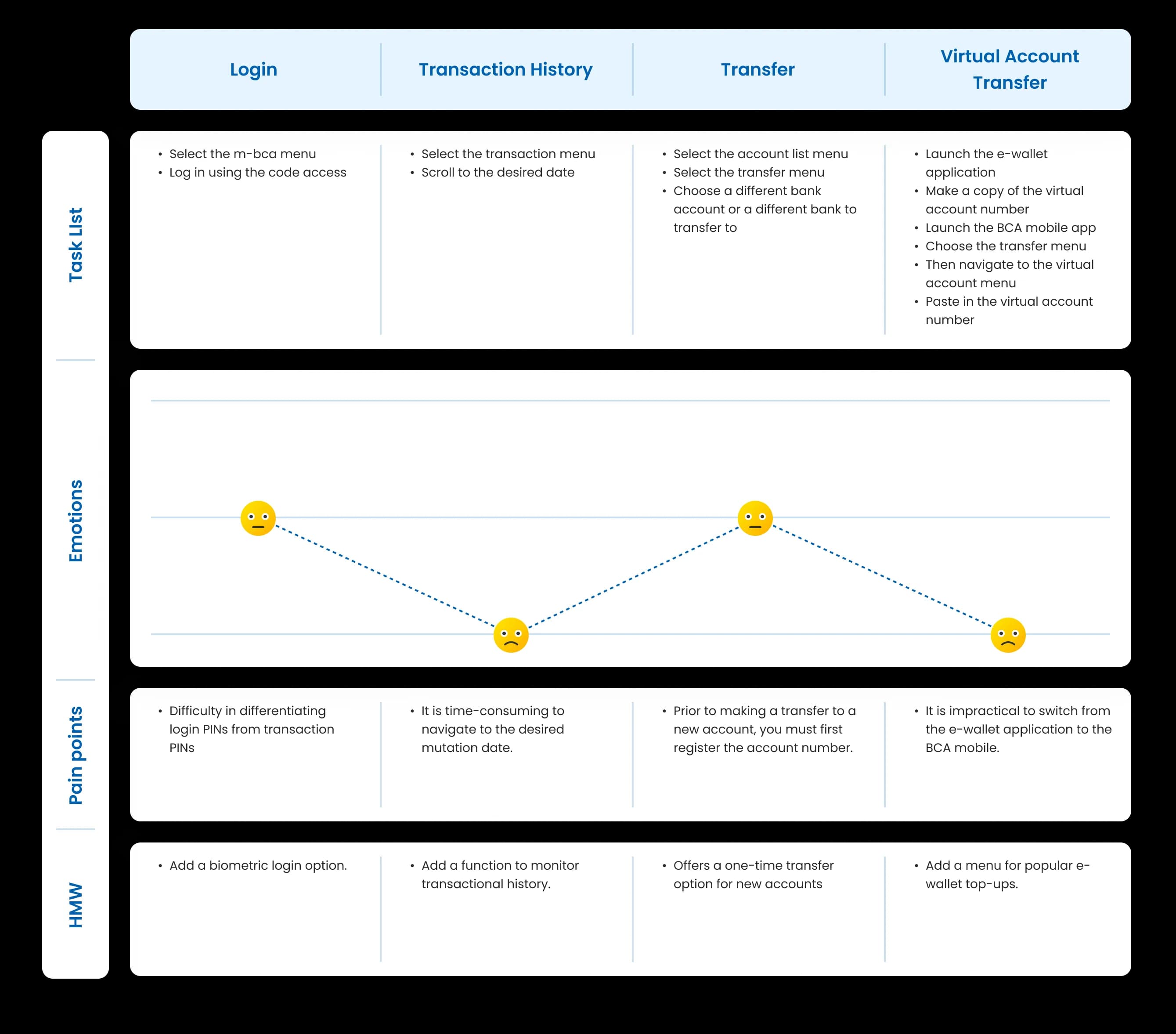
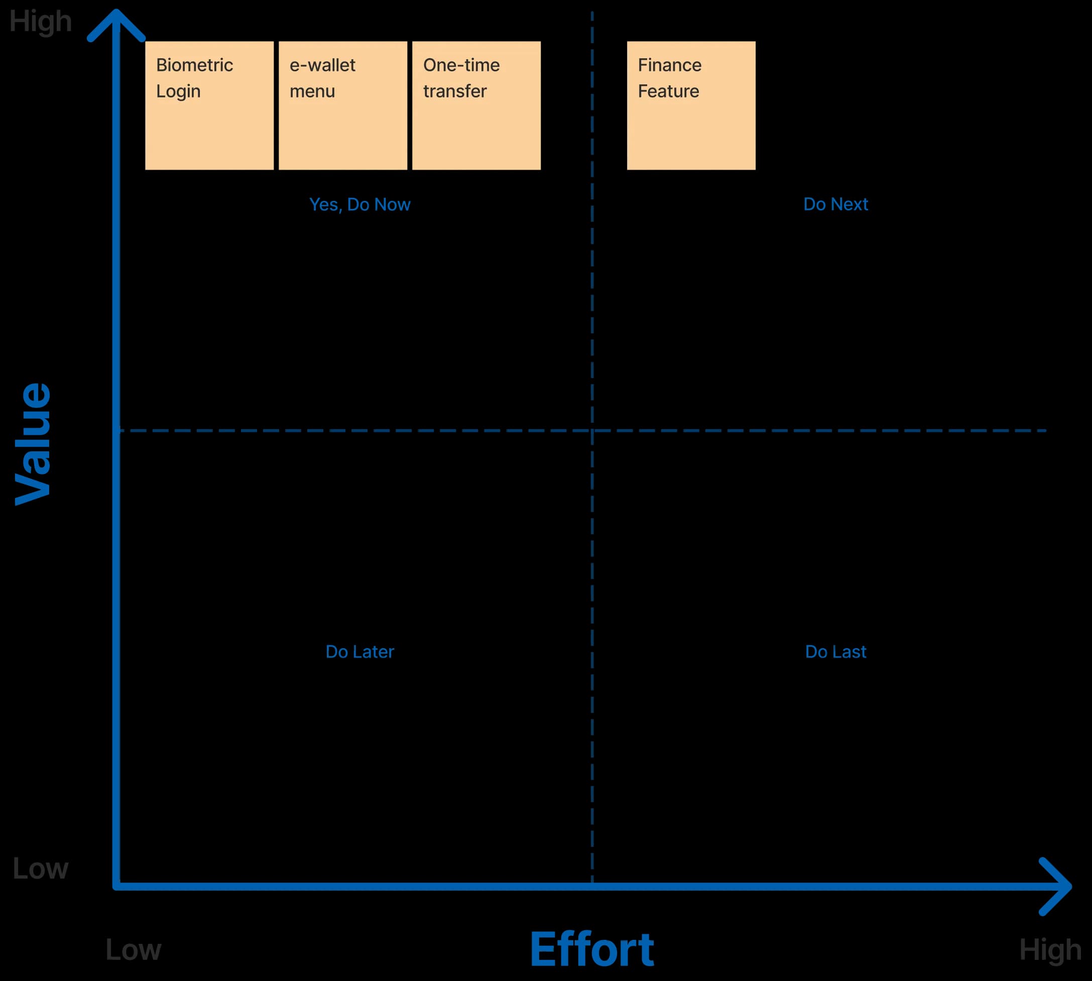
A user journey map traced where friction actually happened in the existing app, and a value-versus-effort matrix decided what got prioritized in three weeks instead of trying to fix everything at once.
Primary user persona
User journey map
Prioritization idea
04.
Develop
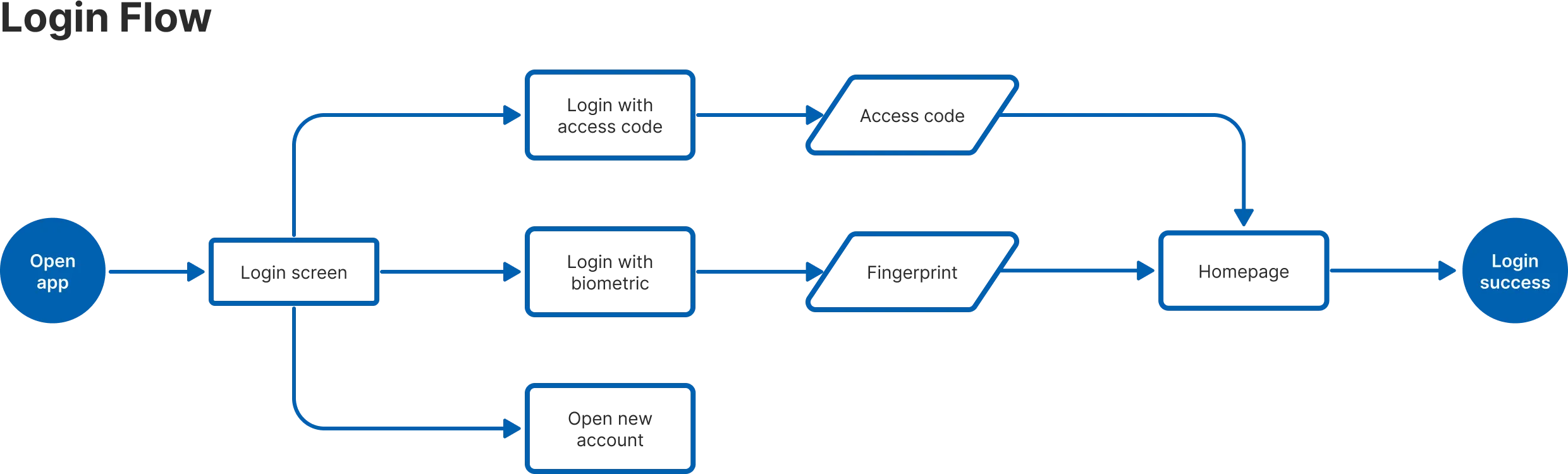
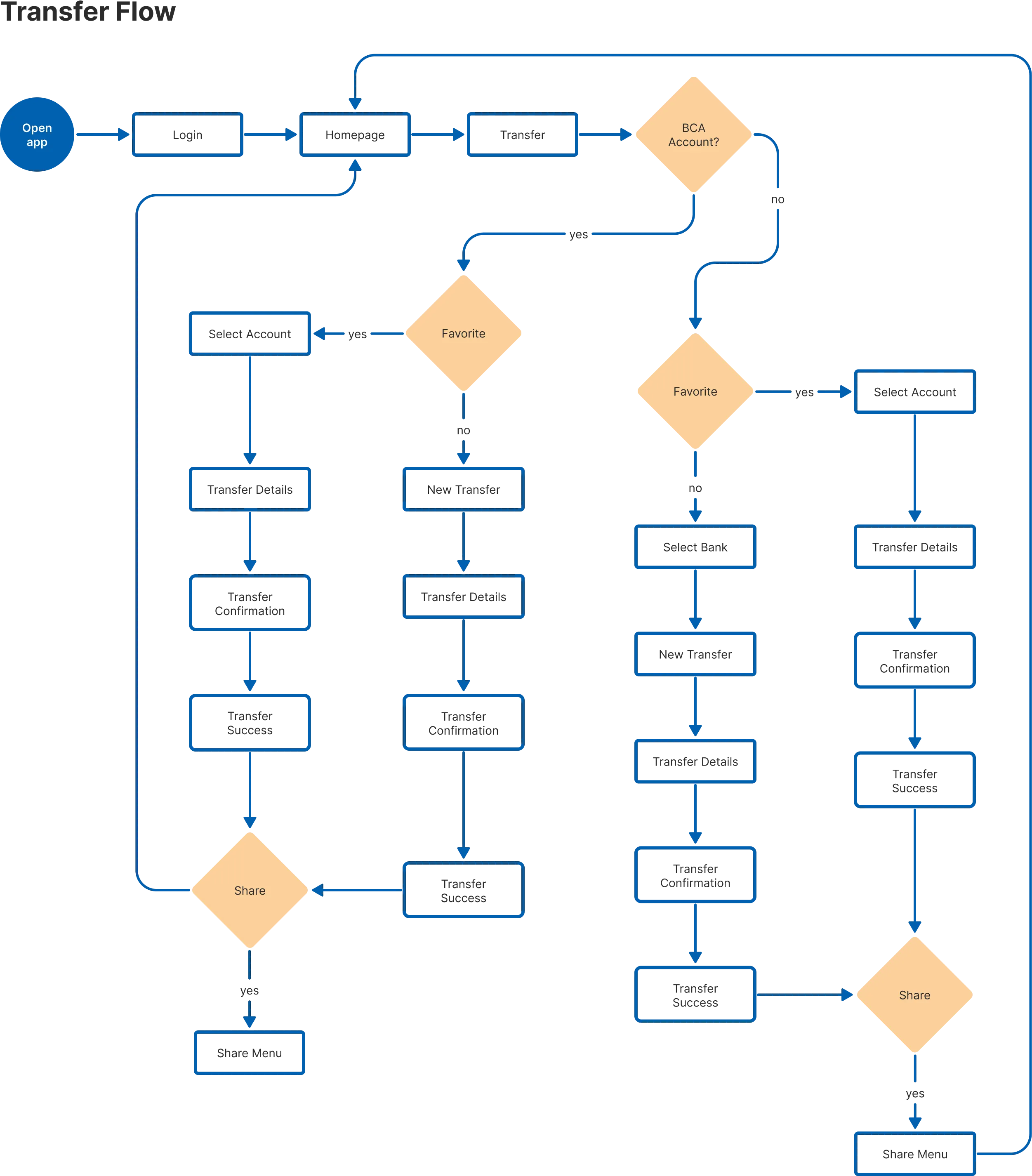
Two flows got mapped in detail before any screen got designed: login and transfer, the two points where the discovery feedback concentrated.
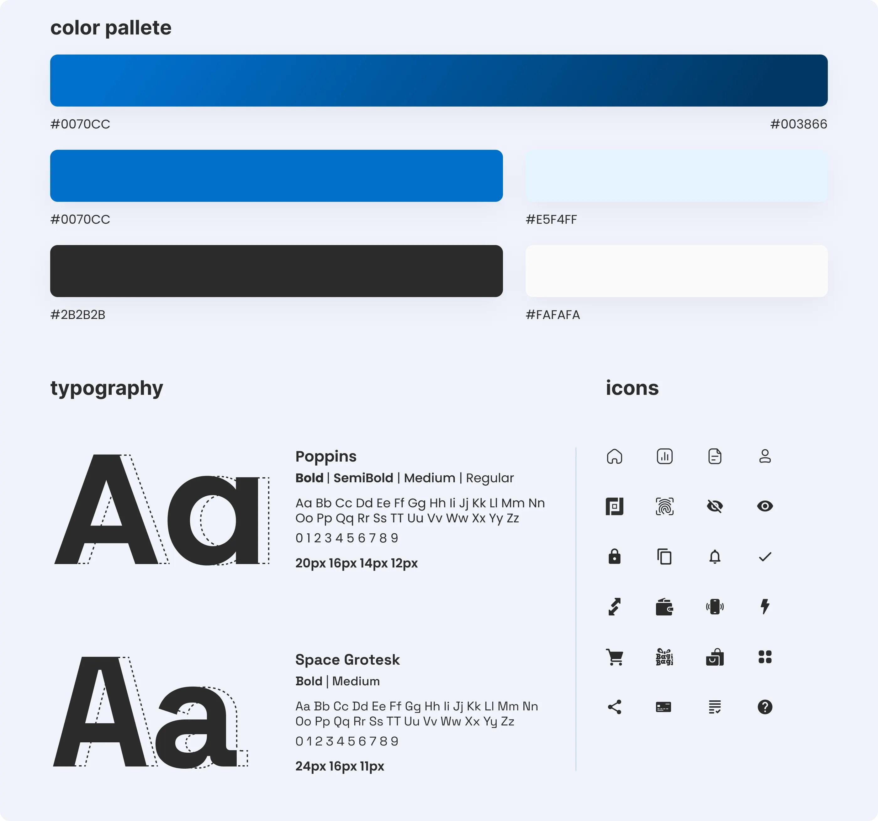
A style guide (color palette, typography, iconography) came out of this phase too, built to stay recognizably BCA rather than replace the brand with a generic fintech look.
Login flow
Transfer flow
Style guide
05.
Deliver
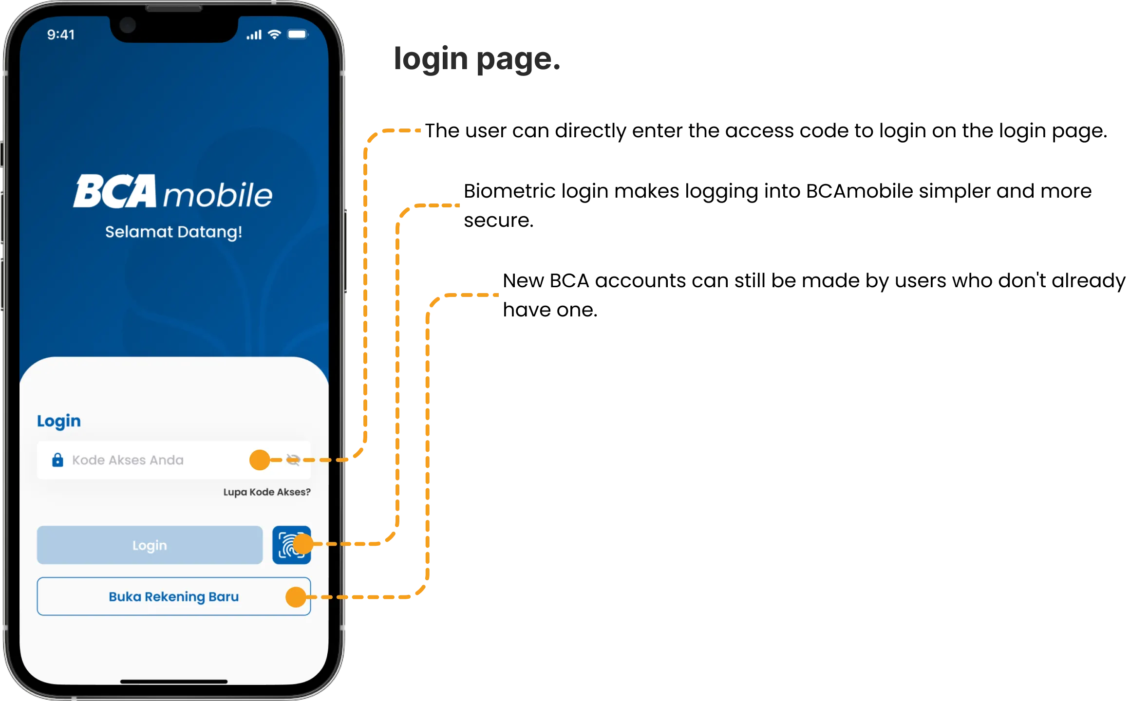
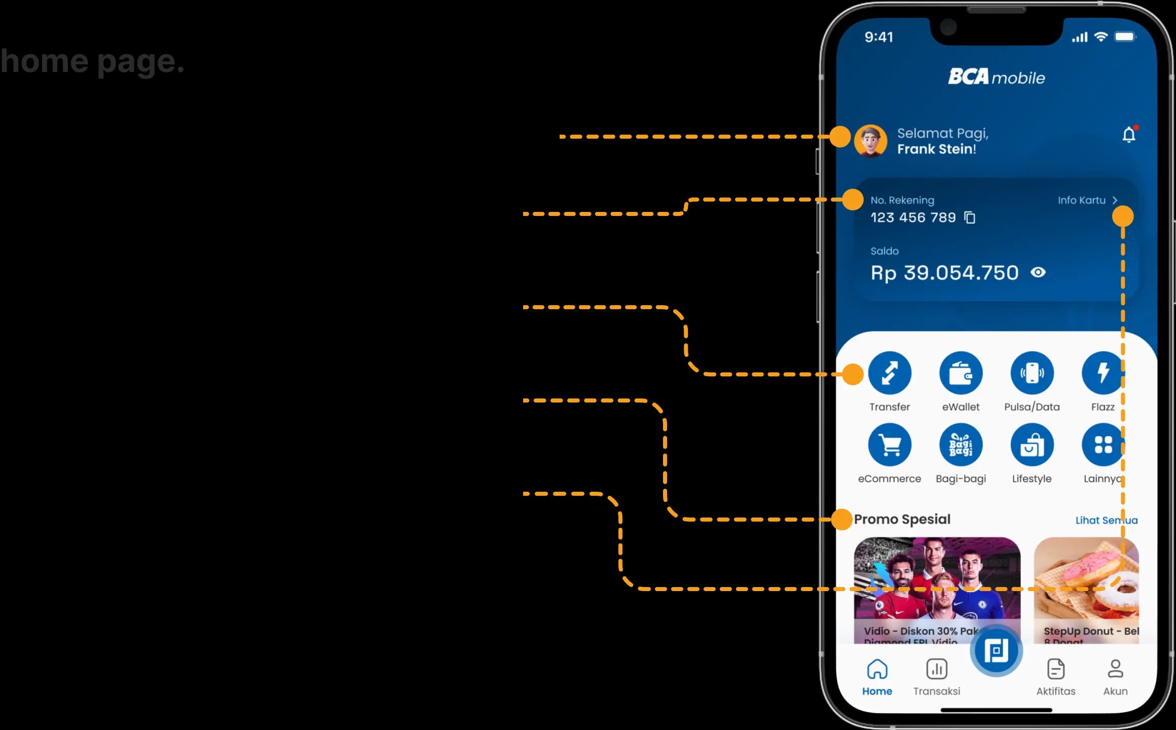
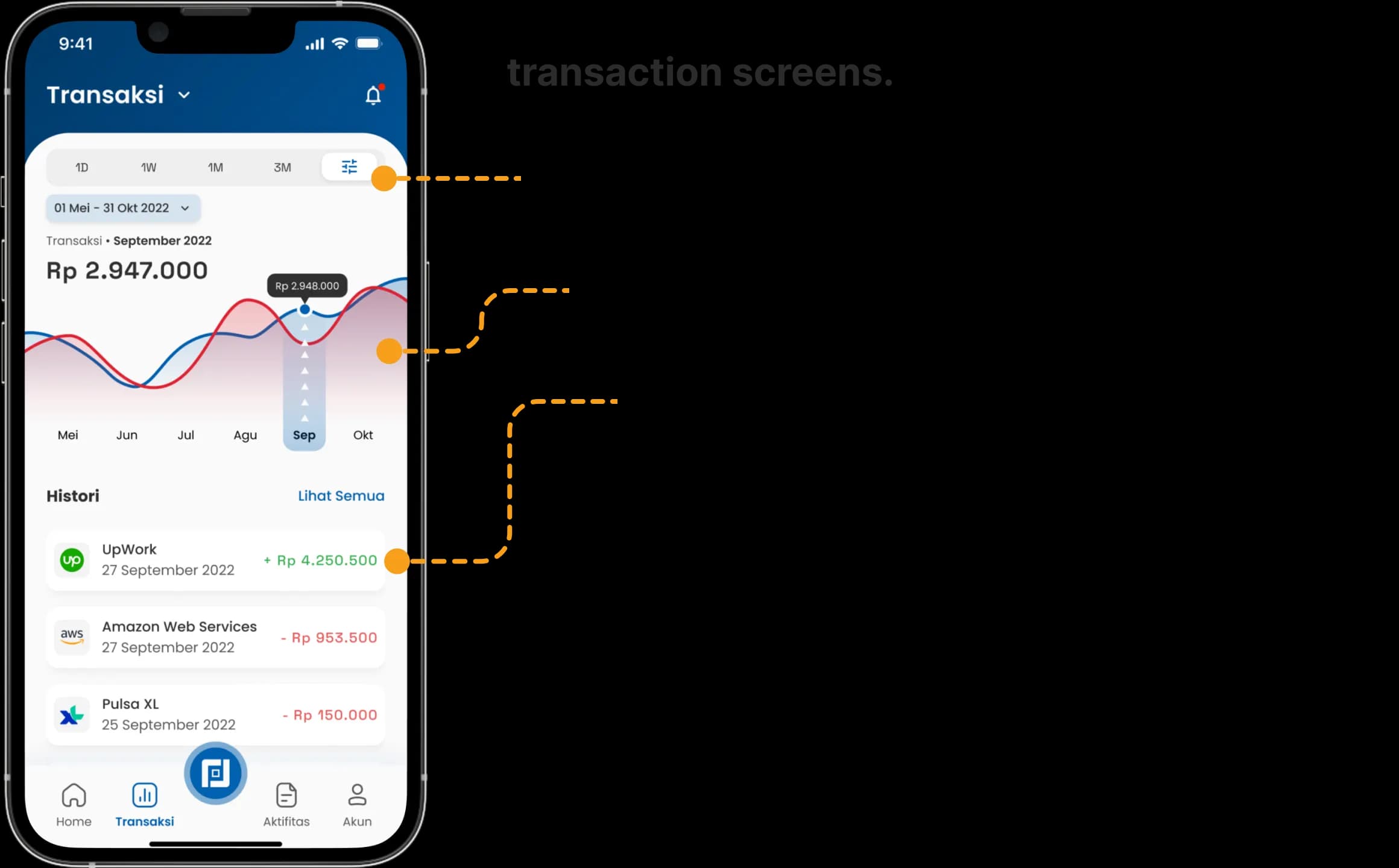
The redesign covered login, home, transaction, and transfer screens, each with the reasoning behind specific decisions annotated alongside the screen rather than left implicit. Biometric login replaced PIN entry as the default path. The home screen prioritized the actions the discovery phase showed people actually needed fast.
UI - Login page
UI - Homepage
UI - Transaction page
06.
Testing & Results
The redesign got tested against the original using a Single Ease Question survey and a Maze usability test, run with participants between 17 and 58 who were current or former BCA Mobile users and regular mobile banking users. Testers completed core tasks, logging in with biometrics instead of a PIN, checking transaction history, sending a transfer, on both versions.
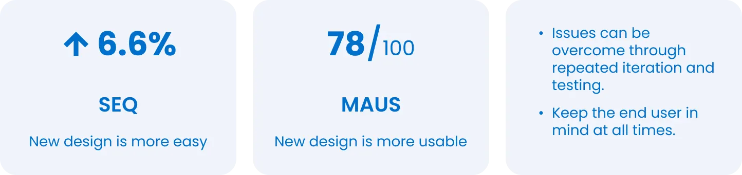
The redesign scored a 6.6% improvement in SEQ over the original, and achieved a Maze Usability Score of 78/100.
SEQ score; Greener is better.
Maze usability score
07.
Reflection
This was a three-week solo process, research, testing, and all, on an app I have no access to the real user base of. The SEQ and Maze scores are honest signals from real testers, but they're testers I recruited, not BCA's actual customer base at scale. That's the ceiling of what a concept study can prove, and I'd rather be upfront about that than let the numbers imply more than they do.
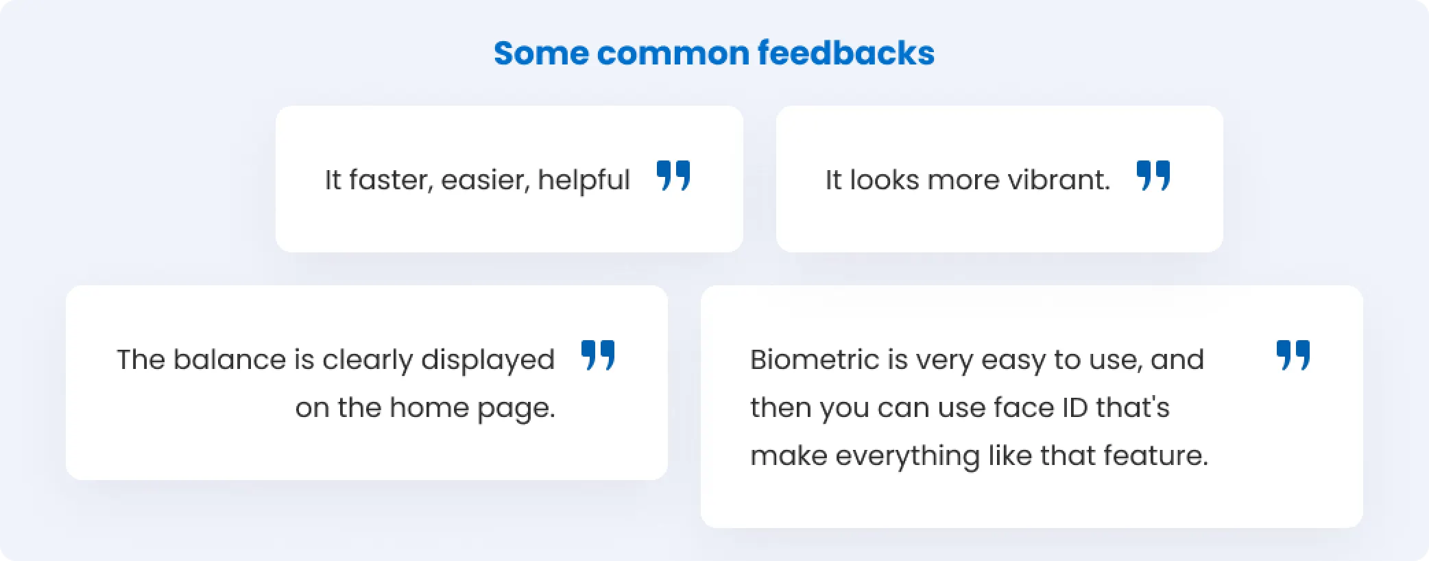
Some common feedbacks
Summarize result
MUHAMMADKUKUH

© 2026 - madebykukuh, All rights reserved.Privacy Policy